This is a very important revelation to me on the subject of the 'biology of seeing' in the book, 'Vision and Art' by Margaret Livingstone. What becomes apparent to me is that the animal kingdom does not see color and sees the 'where' and not the 'what' of something. I shall be aware of this and see what it suggests with my horses. Makes sense. Even more so, expands the possibilities of my art work and why I paint like I do.
Margaret Livingstone, "Vision and Art" the biology of seeing.
Throughout the ages, artists have discovered emprically much about how the eyes see and how the brain perceives images. The earliest known cave-paintings, for example, are effective because our brains fill in the details around a simple line drawing. As observed by Margaret Livingstone, professor of neurobiology at Harvard University, "Artists have been studying how we see a lot longer than us neurobiologists. The disciplines of art and science converge at the biology of vision."
What may come as a surprise is that the visual system does not simply transmit a fully formed image to the brain, the way a camera might capture an image. Light from an image travels into the eye and strikes the retina, where it activates the rod and cone photoreceptors that convert light into a signal to be sent via retinal neurons to the brain.
"The function of the visual system is information processing, not image transmission," said Livingston, reminding the audience, "There is nobody up there to look at an image."
A key to understanding how we see was the discovery that the visual system is optimized to perceive sharp contrasts in the amount of light coming from an image, while ignoring subtle changes in light, which are usually less biologically relevant. Retinal neurons are patterned in what is known as "center-surround organization." The neurons fire when light hits the center of the cell's visual field but firing is inhibited when light hits the surrounding portion of the field. The center-surround effect optimizes the visual system to detect discontinuities, or edges. "Essentially, center-surround cells convert an image into a line drawing," said Livingstone.
Artists have developed techniques that take advantage of our preference for contrasts to give paintings a three-dimensional appearance. Before the Renaissance period, painters often used luminance in a piecemeal manner across the painting. Leonardo da Vinci and others of his period realized that they could enhance the illusion of depth by placing dark colors next to hues with high luminance. Luminance (also called "value") describes how much light comes from an object, and when high-luminance colors such as yellow are placed next to low-luminance colors such as dark blue, they create a strong contrast that the visual system interprets as a change in depth. The center-surround effect is also responsible for the optical illusion that colors look different depending on the color of their surroundings.
Artists have known for a very long time that color and luminance can be treated in an artistic sense quite independently. Picasso said, "Colors are only symbols. Reality is to be found in luminance alone."
Claude Monet. Impression, Sunrise (1873). Musée Marmottan, Paris. Monet's sun has equal luminance with the background. Click to enlarge.
It is possible to have a color contrast that has no luminance contrast. One artist to explore this effect is Monet. In his painting Impression, Sunrise, the sun is quite bright and shimmers in a peculiar way. Livingstone measured the luminance and found that there is no luminance contrast between the sun and the background, yet you would expect there to be one because in real life the sun is quite a lot brighter than its surroundings. "It is this use of equal luminance that gives the sun its very peculiar and fascinating quality."
The what and where systems
The visual system can be divided into two areas that are distinct both in location and function. One pathway, located in the temporal lobe of the brain, is responsible for face and object recognition. It tells you what you are looking for, so it is sometimes called the "What" system. This part of our visual system is evolutionarily recent and common to primates only, said Livingstone.
The other major subdivision of the visual system is located in the dorsal region of the brain, and it processes motion, depth perception, spatial organization, and figureground segregation. This part of the visual system is evolutionarily older, and we share it with other mammals. Neuroscientists call this the "Where" system.
The What and Where systems of the brain. Click to enlarge.
The evolutionarily old part of your visual system—the Where part—gets its input from the evolutionarily old parts of your retina, which are not sensitive to color. "There is a whole subdivision of your visual system that is color blind," said Livingstone. Luminance is interpreted by this color-blind part, so color is not required to see luminance differences. Nor is color necessary to see depth. Depth can be created using shading, perspective, figureground segregation, and luminance contrast, but color is not required.
Luminance is one of the primary cues that make you realize you are looking a a three-dimensional object.
Luminance is one of the primary cues that make you realize you are looking at a three-dimensional object rather than a flat picture. In his paintings of the Rouen Cathedral, Monet used luminance to achieve the effect of depth. Shadow or shading is an important cue as well, but the color of the shading doesn't matter. In Matisse's The Woman with a Hat, the shape of the face is to be found in luminance alone.
Moving pictures
The ability to see motion is carried by the color-blind part of your visual system too, said Livingstone. Inducing a sense of motion in a painting is something quite powerful, and artists have been painting things that move for centuries. While some artists became experts at catching the body angle and musculature of people engaged in action, these paintings can look strangely static compared to some of the Impressionists' works depicting movement. Monet achieved the effect of motion by using black, blue, white, and yellow patches in his water. The black and white are higher contrast than the yellow and blue, which introduces a timing difference in your visual system that is interpreted in brain as motion.
Akiyoshi Kitaoka, Rotating Snakes (2003). This picture by psychologist Akiyoshi Kitaoka appears to move due to the luminance contrast between the black, blue, white, and yellow. Click to enlarge.
Livingstone's research on dyslexia has revealed that dyslexic people have trouble with the timing of the Where subdivision of the visual system. To people with dyslexia, text looks like as if it is jumping about on the page. Dyslexics also have trouble discerning motion, depth, spatial organization, and figureground segregation. "The symptoms of dyslexia are similar to those of people who are cross-eyed." Dyslexic people also are often very talented artistically.
In living color
It may come as a surprise that the color system (a subdivision of the What system) is comparatively low-resolution. The color processing cells in the brain have rather large receptive fields. Because each cell can fire off just one signal at a time to the brain, overall there are fewer signals and thus lower acuity. Because your color resolution is so low, your visual system doesn't use color to define contours, it just lets color spread until it hits a border. Or as Livingstone put it, "Artists figured this out long before neurophysiologists—you do not have to color inside the lines."
The television industry took advantage of this low resolution when it created color TV. Because color images did not need to be as high in resolution as black-and-white images, broadcasters could fit both color and black-and-white signals into the segment of the broadcast spectrum allotted to them by the Federal Communications Commission (FCC).
Out of focus
Our central vision has high acuity, but our peripheral vision has lower acuity. Our peripheral vision is slightly out of focus, a fact we don't notice because we shift our gaze several times a second. Livingstone thinks low peripheral acuity may explain the Mona Lisa's enigmatic smile. Her expression seems to change depending on whether you look at her eyes or her mouth. Livingstone believes this is because as you look at her eyes, her mouth seems to smile more than it does when you look directly at it. "You see her smiling almost behind your back; when you try to catch her smiling, she stops," said Livingstone.
Click to enlarge.
In the slide above, filters have been applied to make the painting look as if it had been viewed by the peripheral, near peripheral vision, and central vision. The Mona Lisa looks like she is smiling more in the image generated by the peripheral vision.
This low-resolution trick is employed in photomosaics such as those created by the American photorealist Chuck Close. Your low-resolution peripheral vision helps you piece the entire portrait together. As you move your eyes around one of Close's canvases, you notice that different parts pop in and out of high resolution. "This is another way in which artists have figured out how to get a dynamic quality from a static image, said Livingstone."
Stereopsis
Artists can also make more realistic images by taking advantage of stereopsis, the perception of depth generated by the natural horizontal offset between the two eyes. The visual system uses the offset between the eyes to calculate depth, along with other cues, including perspective, shading, occlusion, and relative motion.
Even a painting with all these cues can look flat if it lacks stereoptic clues. These clues can be added, as the painters of the Impressionist era seemed to realize. "The Impressionists said they could paint the air," said Livingstone. "And I think they did that using false stereo cues."
A remarkably high proportion of famous artists have eyes that are not lined up, limiting their ability to see depth.
Some artists lack the ability to see stereopsis, a trait which may help them capture the world on a flat canvas. Gustav Klimt, for example, could not see three-dimensionally because his eyes were misaligned. "If your eyes are not lined up, you cannot see stereopsis because the connections from the two eyes don't end up in the same part of the brain," said Livingstone.
Livingstone reviewed the portraits of famous artists and found that many, including Rembrandt, appear to have had misaligned eyes. "A remarkably high proportion of famous artists have eyes that are clearly not lined up."
Artists clearly have a head start over biologists when it comes to understanding many aspects of how we see. As biologists learn more about the biology of vision, artists may uncover a new trove of techniques for creating compelling and realistic images
6/18/06
Sandpoint Paintout i.e. (Rainout)

Went to Sandpoint, ID., to a paintout. Had a great time even though it rained seriously for two of the 3 days we were there. Met some great artists and was just what I needed both for my work and socially. Living and working here in paradise has its drawbacks one of which is the fruitful interaction with other artists.
I regret that I didn't take more photos but did 4 oils and 15 sketches and watercolors that attracted the attention of a great guy and gallery owner Jim Quinn who asked me to do some more little (2"x2") watercolors of area scenes. It's kind of a mixed blessing but not surprising that many like my little journaling studies and I hope to aspire to BIG paintings. Got to figure that out. I think it has something to do with simplicity and not overworking things. I learned "Simple is Best" from horses, probably as true with art.
Sold paintings, got a couple galleries and a commission as well as an invitation on an excursion to the Valhalla's in Slocan, BC. Should be some awesome sites as well as artists.
I sold a painting to a nice person that works at the Hope Cafe. She and her children came to the artists reception and sale and purchased an oil I did of the Hope Car Cabins that were built in the '30's. Kally Thurman is the owner as well as the owner of the Outskirts Gallery in Hope, ID, where she has a wonderful collection of NW artists including Harold Balaz and Mel McKuddin as well as a book store. Betts and I went away with as many books as we left of my paintings. She has a wonderful cherubic intellect. I recommend to anyone that happens through the area should stop and visit.
The Hope Market and Cafe is run by Bob Kessler and is a sublime surprise. There is an exceptional collection of wines and cheeses as well as good food prepared by Bob and his wife. N. Idaho should be proud to have such eclectic personalities in the midst of beautiful scenery and climate. Cheers to you all!

6/02/06
Paint what you know
To get a handle on the situation I do a drawing or a watercolor. Sometimes I would catch a glimps of an image such as a sea lion on a rock and take a mental picture of it then when the opportunity allowed I would draw a simple sketch of the memory. I find that I have developed the ability to take a 'mental picture' of the scene and fill it with as much information as I am capable. The drawing that comes from such an exercise is distilled down to the essentials. I have also learned to not make so much work out of things. I catch myself worrying a painting or drawing to death. I need to trust my first impressions and also expressing that impression.

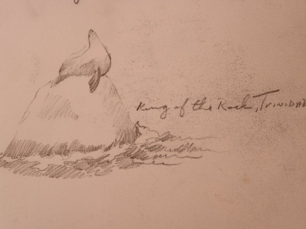
The Warf at Trinidad is owned by Native Americans. At the end of the warf on the shore is a great place to eat breakfast. I had an oyster omelet that was excellent. It is a great harbor and many fisherman are moored to buoys. We had 3 incredible days of sunshine.
During our trip we saw sea lions, harbor seals, oyster catcher, fox, antelope, herds of elk and birds we had never seen or heard before.
Paint what you like
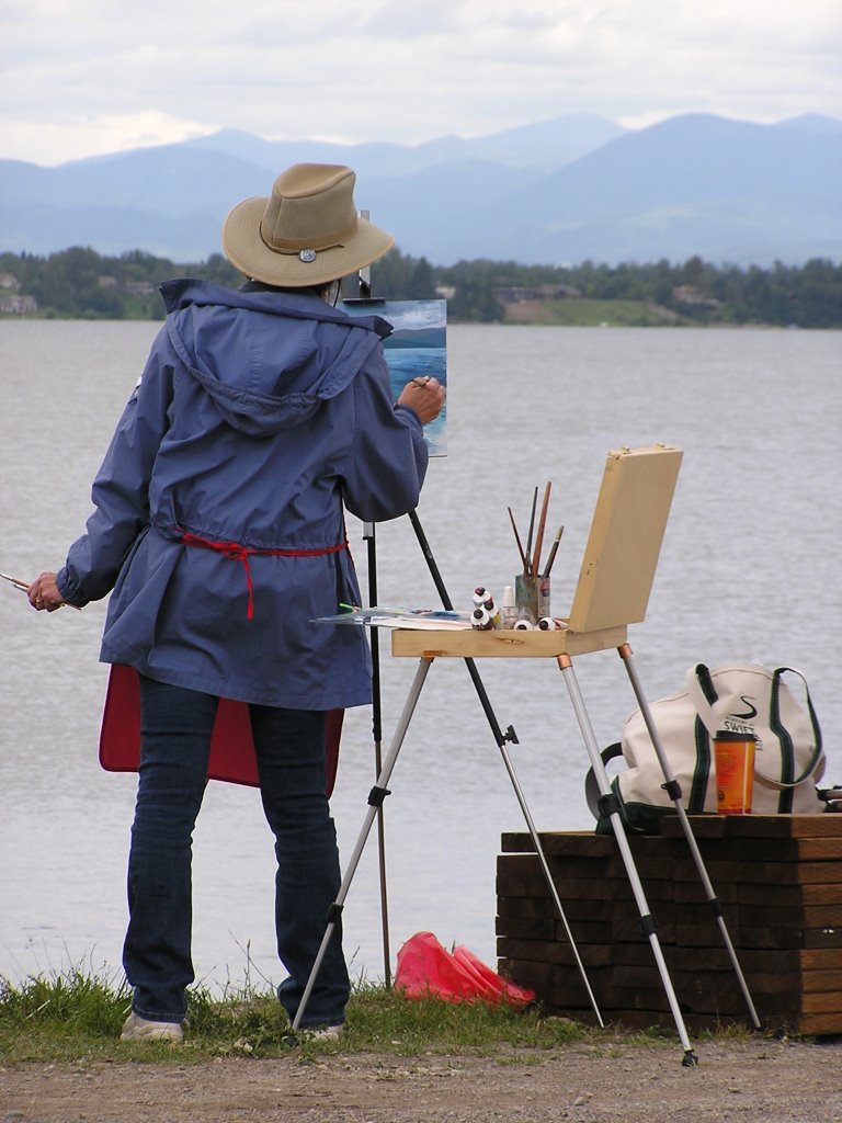
Part of the problem with Plein Air painting is developing a composition. If you just paint what you see you might as well use a camera. You have to maniputlate the information the landscape offers. Knowing how much of your imagination to use is difficult.
I've never painted at the ocean and the amount of information to filter was intimidating but as usual I just chucked my inhibitions as soon as I got to painting and enjoyed moving things around.
I worked around the sky, knowing that the sunset would be glorious but brief. I'm not sure I contrived the light on the rocks correctly but was happy with the composition if not the novelty of the tides breaking against the rocks.
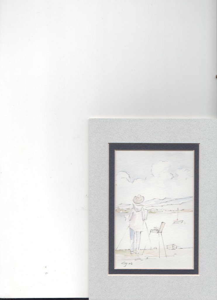
"Wedding Rock" 12"x16"

I've never painted at the ocean and the amount of information to filter was intimidating but as usual I just chucked my inhibitions as soon as I got to painting and enjoyed moving things around.
I worked around the sky, knowing that the sunset would be glorious but brief. I'm not sure I contrived the light on the rocks correctly but was happy with the composition if not the novelty of the tides breaking against the rocks.
"Wedding Rock" 12"x16"

"Paint what you see"
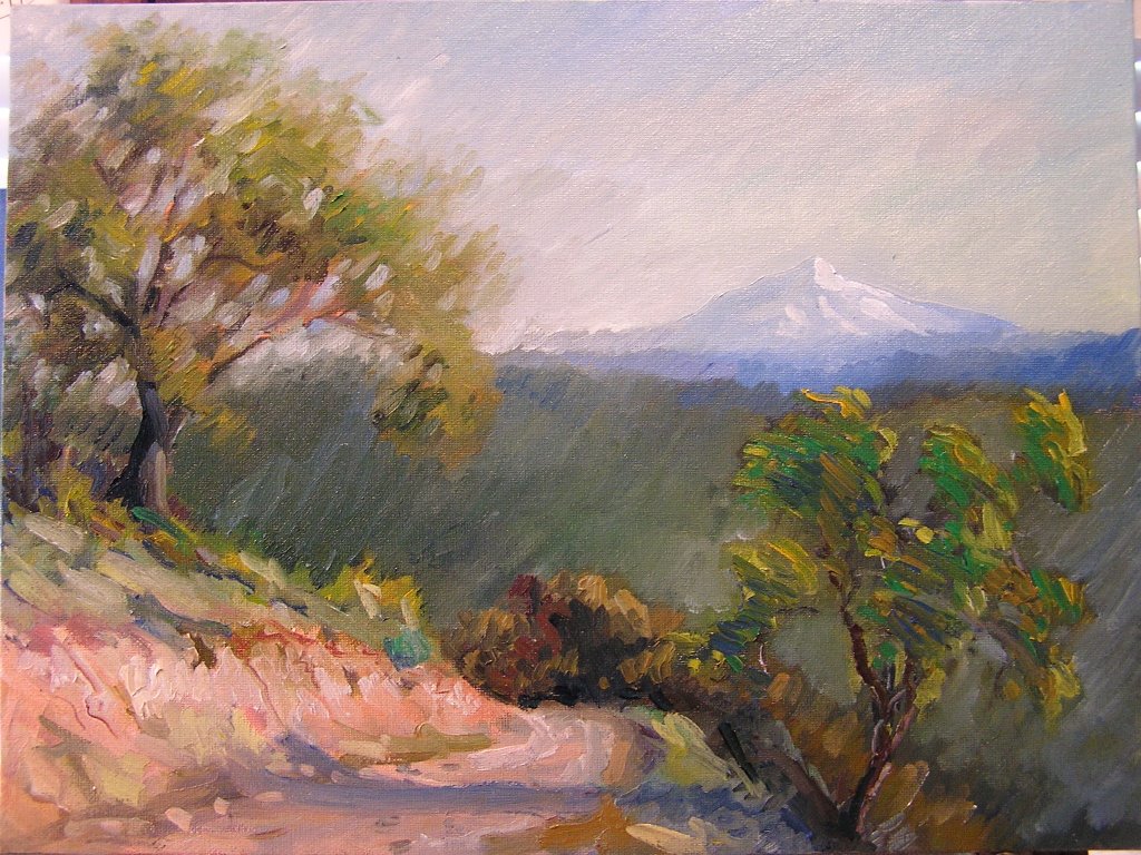
Early in the morning I wound my way up out of Redding and found this view of Mt. Shasta. I really wanted to spend some time painting the oaks of California. Individually they are intriguing and make strong designs on the hills. There are a few things going on in this painting that I like. The road cut is the impasto effect I'm trying to achieve. I'm finding it easier to work this way and delight in pushing the thick paint around and loading my brush with many colors. I try to refrain from overworking the paint and allowing it to blend together on the canvas. The red soil of California is a great opportunity to use colors I haven't had the opportunity to use and make for great purple shadows.
"Paint all the time"
"Paint what you know,
Paint what you like
Paint what you see
but paint all the time.
Paint what you like
Paint what you see
but paint all the time.
Oil, 12"x16", "Pine Tree, Lake Tahoe
Plein Air on the Road, WA to CA
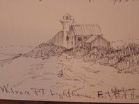 Wilson Pt., Lighthouse is on the elbow of the Olympic Penninsula, Wa where the Strait of Juan de Fuca turns south to become Puget Sound. I was at Port Hadlock for meetings of the Washington PUD Association. I managed to carve out some time early one morning to do some drawing and painting. I did a lot of drawing and watercolors on this trip to Lake Tahoe where I had another meeting of the Northwest Public Power Association. Me and my friend Betts took the long way down and back.
I made a pochade box to keep 10, 12x16 canvas boards that worked well to contain messy oil paintings that would otherwise get all over everything in the car. This painting is on masonite because my order of archival canvas board didn't arrive before I left. I don't like the slick surface of masonite but worked with it to achieve some new effects. The sun came out for a moment at about 5 a.m. and I captured the colors it made on the sky. The wind on the west side of the point where I chose to set up was strong and cold. Just 100 yards to the leeward side the wind abated, so much for choosing a comfortable spot to paint.
It is an interesting area with the remnants of cannon placements made to keep Japanese subs out of the sound. There were 3 forts set up in such a way that a vessel would find it quite difficult to sneak by.
We stayed in Port Townsend which is full of galleries, boutiques, and fine old buildings occupied by the 'fringe' element of artists and creative types. There is also the school of wooden boat building and many vessels moored at the local marina. Betts found the proprietors receptive to the www.shopthefrontier and intends to follow up some business contacts.
 From Port Townsend we traveled by Mt. Hood, Oregon and made our way down to Northern California. Betts loves a good hot tub and when she saw "Hot Springs" we took the next turn and found ourselves following the trail that brought pioneers to California over "Fandango Pass". We discovered an obscure valley of alkali lakes and weren't too impressed until we started seeing some great wildlife. We found the smallest indian reservation I've ever heard of, the 3 mile squarem at Fort Bidwell. The town was absolutely empty. Sheep walked the streets and we discovered a tree full of turkey vultures. I counted more than 30 of them in a cottonwood. I can't imagine what so many vultures found to eat.
We were informed by the local town greeter who was obviously not very far from his bottle of inspiration that the reason for steam vents and hot springs was that there were faults on both sides of the valley but not to worry there hadn't been any earthquakes lately. He was a happy fellow and pointed out our destination. On the way we discovered that the streams in the valley were running hot water and steam rose in the humid air all around the valley. I saw my first Sandhill Crane which were plentiful and quite a common sight as they were eating the newly planted grain of farmer's fields.
From here we headed south to our rendezvous at Lake Tahoe. We weren't looking forward to the interruption of our leisurely tour of the countryside but ended up having a good time in the casinos and learning about the state of affairs of the power industry.
4/29/06
Painting at Sisters and John Day Fossil Beds

We all met at the annual Small Farmer's Journal Auction in Sisters, Oregon. This year along with a couple buggies I took to sell I set up my horse trailer as a gallery. Kind of announcing to the teamster crowd that 'ol Greggor is plowing a new furrow, that of a painter. Had a great time doing some sketches of old timers. Might bone up on portraiture and try to capture the ol boys before anymore of them hang up their harness for good. Did two oil sketches of Vern Leathers and Dan Kintz. Dan didn't stop telling yarns the whole time I was sketching. It took a couple days as we had to hang it up due to rain. Dan ended up with the painting and bought a frame to protect it on the way home.
Fellow teamster and Horselogger, Rod Gould, from Greenwood, B.C. took the time on the way home to go through the John Day country and do some sketching of the Fossil Beds. It would have been great but my tailgate fell off the pickup and I ran over it with the horse trailer. Luckily Rod was following and stopped and drug it off the road. Kind of an interesting sculpture now. We couldn't travel at night because it tore the pigtail for the trailer lights out so we made the best of the situation and camped over at the Fossil Beds to do some painting.
The fossil beds are pretty outrageous landscape. Kind of like what Mars must look like. I would try to capture more details next time rather than the over all landscape as the details are wonderful colors but are more believable than the incredible ash flows.
4/04/06

I did this painting for a poster contest for our local fair. It is a scene of a "Pony Express Race". The yellow T shirts and bandannas signify the 'Moses' team of Sonny Moses who passed away as a young man but his family still races his horses. The rider is famous for his 'flying mounts'. It is a stunning event where there are 4 or 5 teams, each team has a handler, catcher, rider and 3 horses. The race is started from a standing start, each heat is a lap around a quarter mile track, as the horses near the grandstands the catcher flags his teams horse and the rider jumps off and runs to the next horse that his being held by the holder. It doesn't usually go anywhere near as smooth as all that. There are wrecks as the catcher may be run down by the charging horse or the rider falls off leaving a loose horse to circle the track, riders rarely use saddles and run the race bareback at full speed. It's very exciting and has been a tradition going back decades.
The painting was done in the old technique of an underpainting or grisaille although I think 'grisaile' is a full composition done monochromatically. I achieved some interesting effects and was able to construct the composition very deliberately. It is a good illustrative technique when the purpose is to relate information. Because of my close association with horses I concentrate in getting the anatomy correct and fill the picture with details of the subject and event. I can see where such work would improve an artists skills and is why many collectors value such work, it is straightforward and doesn't require interpretation.
3/11/06
March '06 paintings, "On your Game"
"Belgian Study", 16"x20"
"March on the Sanpoil", 11"x16"
It's good to get back to painting after traveling on business for the Washington PUD's. You have to paint everyday to be 'on your game'.
Paul Dorrel, "Are You Making What You're Worth?", April addition of the Artist's Magazine, explaining to a patron that is new to purchasing art about the seemingly high price of artwork. In answer Dorrel, explained the amount of time, perhaps decades and training an artist invests in his career and although a painting may not reflect the hours of time it took to make it, the painting was a reflection of all the effort that lead up to that point. Dorrel also points out the role of the artist to society is as important as that of any other career be it legislator, archetect or engineer and to allow for that in your pricing. Those thoughts resonate with me. Sometimes it's difficult to continue when the financial challenges are so daunting. Such considerations challenge innovation and the exploration of technique or even content.
People want what is safe, especially in times of social duress but in fact it is this duress that motivates 'new' points of view and the challenge of established status quo whether it is in art or our homes.
In these studies I have been influenced by an artist I met and hope to have the opportunity to work with, Robert Krogle. www.robertkrogle.com . An exceptional draftsman his paintings are masterful. I bought a portrait study and have scrutinized it.
Solid basics of drawing, value, edges,color and technique. Thick over thin, back to front, light over dark.
I hope to get to Couer d'alene, ID. where artists are working together in studio to keep inspired and be challenged by fellow artists. Except for Everett Russel, Republic artist this area is pretty remote from other artistic influences.
Subscribe to:
Posts (Atom)